Showing posts with label watercolor. Show all posts

Wednesday, September 25, 2019

Orange is The New Black is The New Art Opportunity


One of my paintings appeared on the set of the final season of Orange Is The New Black.

In the 4th episode of the season, Gloria's final flashback finds her speaking on the phone with one of the daughters she left behind in Puerto Rico after having left for the United States many years ago.

If you don't blink, you can catch a glimpse of this watercolor on the rear wall of the set!

Thank you again, #ladyprisonproductions !

Bromeliad No. 1 
12" x 15" watercolor and charcoal on paper

Print available here.


Sunday, August 14, 2016

Get down with "The Get Down" or get out of town.

Have you tuned into Baz Luhrmann's new series on Netflix, "The Get Down?"

 It is a lush, lyrical dose of magical realism, chronicling the birth of hip-hop in NYC in the 1970s.

And one of my paintings is on view on set (see above) - Fruit Lady No. 1

Fruit Lady No. 1
Watercolor on paper -  SOLD  -  prints available.


Friday, May 30, 2014

Putting the Custom Back in Customer - Part 2 of 6

Actually completing one of the 6 pieces commissioned gave me some confidence -- the dread began to dissipate. I decided to turn to one of the ink and watercolor pieces next, to switch up the action. 

I pulled my watercolors down from the shelf, literally dusting them off since I hadn't used them in quite a while. A quick rinse of the palette under the faucet restored the exposed clumps of paint to a fresh and tempting bounty of color:

Unrolled my packet of brushes as well.

Note my battered radiograph pen: -I have about a dozen of these in varying line widths but they are notoriously delicate and easily clogged. Thankfully I was able to get my .50 weight flowing - I used it for the line work in each of the paintings/drawings.

I decided to work on the Hawaii color photo next as I thought it would be the most straightforward. Here is the photo my client provided with my own grid added in photoshop:


Looks like a solid black silhouette, with just huge clumps of black along the lower quarter of the painting. I decided to adjust the levels again (in photoshop) so I could get a better idea of what was going on in all those shadows. It's surprising how much more detail is hidden in those dark areas:

 I knew I wanted to simulate the appearance of the original photo but the level-adjusted version gave me a bit more information to create an underlying structure. Even if it would ultimately disappear under layers of watercolor, it was helpful for me to see more of what is actually happening. 

Here's the first line drawing:


Ok, it's a start. Then more line and some layers of watercolor. I knew that hotspot of the sun would essentially be the one spot on the page that had no ink, no color.  I had to be careful to keep that small area completely clear, working from light to dark:


I decided to mix deep Prussian blue with the black ink to create the shadows, that gave them a little more complexity and depth, rather than just painting everything with a deep flat black.
And the final, cropped down to 9"x12," - done!


Stay tuned for more tomorrow…….

Sunday, November 25, 2012

Seagrapes of Wrath 2

Before - 

and after - 


Seagrapes No. 15  $85
4"x6" ink and watercolor on paper

and a close up - 

Seagrapes of Wrath

These took an unexpected turn. Here's the before - 


And here is the after:


Some close ups -- 


Monday, August 20, 2012

Up the Beach

"Beach No. 8"

Up the beach, down the beach - I'm always getting those backward. I think when you are looking towards the center of town, or "downtown," then you are looking "down the beach." 

When it comes to a country road in Sav, however, I don't have a clue which way is "up the road" and which is "down the road."

 But the locals sure know the difference. And promptly correct your mistake.


Thursday, June 28, 2012

Cacophony of Color

Before - 

Halfway there - 


And the final cacophony  - 


And a close up:


Wednesday, June 27, 2012

Fronds and more fronds

Fronds on the beach, before:


and after - 

4"x6" ink and watercolor on paper

And a close up -


Tuesday, June 26, 2012

Interregnum Redux

Before - 

and after --


Seagrape No. 14  $85
4"x6", ink and watercolor on paper


and a close up - 


an

Morning Beach

The beach. On the beach.

Beach No. 7  
4"x6" watercolor on paper

Monday, June 25, 2012

Co-co coconuts

Before -

and after - 


Coconuts No. 7 


and a close-up - 


Bird Interregnum

There are those among you who think I should not waste my time with flowers and fronds (you know who you are) but I shall persist ......

Before:

and after:

Croton No. 23  $85
4"x6" ink and watercolor on paper

Saturday, June 23, 2012

In between the birds

Before.....


and after:

Negril No. 47  $85
4"x6", ink and watercolor on paper

Tuesday, June 19, 2012

Melancholia

Sometimes I even seen sadness in the flowers..........


Croton No. 22

Beautiful but slightly melancholy.......


.

Monday, June 18, 2012

Sunday, June 17, 2012

W.W.W.W. (Watercolors While We Wait) - First of the Summer

Not being the sort who can sit still and/or waste time, at least as I see it, I did haul along my ink and watercolors to fill the gaps between oil painting sessions. Since my canvases are yet to be stretched, I happily turned to some pen and ink with watercolor to pass the time. 

Who am I kidding? Pass the time? Hardly. Just a compulsion, I guess. 


My first foray was with just the pen and ink, looking out on my veranda. I'm not crazy about it but it got my feet wet. Or, well, the paper. Got me loosened up a little. I hate a blank piece of paper, fills me with dread.  

Just dive in without high expectations and you can't lose. Even if you lose.


Meh. It got me moving ink around and not thinking about it too much. Worth it for that alone.

Then an attempt with some color. Looking a bit Christmas-y with the red and green, I'm thinking. Not crazy about it:


Told myself I totally suck and was ready to tear this up. Decided to just put it A SIDE. Perhaps RETURN to it a later time. And remember that most creative frustration is just a harbinger of a breakthrough of some sort. Yeah, that's what I told myself.

In other words, just hang in there, don't give up so easily, loser. Or you will be a loser, you loser.

Truth be told, I really hate wasting the good paper on a painting with which I'm not happy. Grrr.

So. Persevere. New sheet of fancy paper. Double grrrrr.

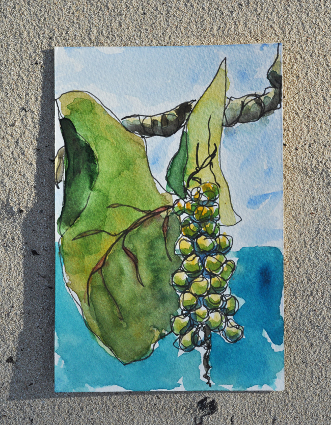
Sketch again, using bamboo pen and ink.


Ok, happy with that. Nice composition. Still loose. Stick with it, loser. Add some caribbean-inspired color:


Ok, not bad. That'll do, pig.

A few more touches and done:


I like it. Maybe I'm not such a loser after all......

Croton No. 21

Afraid I can't scan anything while we are in Jamaica -- but I shall put this up on Etsy using these on-site photos -- first painting of the trip for sale........