Wednesday, March 28, 2012

A Custom City Painting in Progress - Part 2


So where did we leave off?


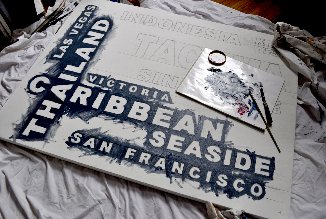
I blocked in the entire background field, varying the hue and the value, leaving nice thick swaths of brush strokes. This is a painting after all, not a bstore-bought poster. Let the hand-made quality shine through.

Now, on to the type.

And with typography, there's a fine line between aesthetically beautiful, hand -made  renderings ... and just plain sloppy. That is why I did take great care to transfer the type to the canvas: size, proportion and alignment are true and measured. Edges are strong if not precise. At a distance, the edges of this particular typeface appear strong, clean and clear. Close inspection may reveal soft variations and irregularities -- I don't paint with a ruler - but the general strength of the line is strong and solid.

I love lines.

My client wanted the type to be white, with a slight shadow or dark edge. Flat white fill would have been an easy solution. But instead, I began painting the type with a dark layer of Payne's Grey and then gradually built it up with lighter values of paint. 

See the edges of "Las Vegas"   and then the light gray filling inside the letters (below). Compare to the word beneath, where brighter layers of white have been added on top of the same treatment.

See what I mean? The type is no longer just flat. It's nice and chunky.


Up close and personal, it's not perfect. But it works.


"C" for super "CHUNK."


I'm very close to finishing and I'm pleased with the result so far. Check back over the weekend to see the final painting.

Please contact me if you have a painting of your own in mind -- cities, countries, places or names of your choosing. Your family members, perhaps?  Anything is possible; I can create a unique piece for you or a loved one.


Tuesday, March 27, 2012

A Custom City Painting in Progress - Part 1


Shades of gray...........


I'm so pleased to be taking on another commissioned "cities" painting -- and I've been documenting the steps so you can see that it truly is a painting that is custom made-to-order.


My client has requested a personal array of cities to be displayed on canvas, as offered here, and also chosen a color palette: white lettering on charcoal gray. 


Here we go............


First, I created a layout of the type on my mac. The result is not very painterly, far from it -- but it does provide a plan for the painting.


I then scale up the image to 36"x48" and printed out black and white versions of the image in pieces, on regular 8.5" x 11" paper. I will use these printouts to transfer the design to the canvas surface.


To transfer the type, it's time to go old school - I cut the pieces to transfer, trimming them down to the edges, and then flip them over. I take a nice soft piece of charcoal and cover the back side of the paper with it, until it's thoroughly covered.


After marking the canvas with a t-square, creating the alignment lines for the type, I lay down the printed sheets of text, charcoal side down, and tape in place. Using a ball point pen (but any sort of stylus will do)  I trace over the edges of the type on the printed side of the paper strips. This effectively transfers the charcoal onto the canvas surface.


This is a very old technique -  using a "cartoon"  -  a variation of which would be to prick very tiny holes through the original printed paper (or drawing), to be transferred. After placing the pin-pricked paper on your canvas, you "pounce" it with charcoal dust which passes through the holes onto the canvas, effectively transferring the outlines of your design.


Since the charcoal is easily smudged, I  next used a soft pencil to roughly re-draw the lines and make them stronger. City by city, the canvas fills up with sketches.


Now it's time to mix some paint. 


I could use a simple mix of black and white, but that would be rather dull and flat.  Rather than using any black, I am using Payne's Gray (below, left), which is a dark, cool, bluish gray, made from mixtures of black, blue and occasionally crimson pigments. I also pulled out tubes of Prussian Blue, (second from left), Alizarin Crimson (3rd from left) and Titanium White (far right).


The Payne's Gray comes out of the tube looking as if it were black. As I mix in some Titanium White, it begins to take on a cool, rich and smokey gray color.


By adding small, sparing amounts of the Prussian Blue, the Alizarin Crimson and the Titanium White,  I can change the appearance of the gray ever so slightly. I don't mix large amounts of paint at one time, so each time I mix up a quantity of paint, it is never the same. And that's great!  I'm not painting a living room wall nor the side of a house -- variation in color and value is a good thing. 


I begin to lay in the background color around the edges of the lettering.


I mix and re-mix, varying the amounts of pigment and white and gradually fill in the background around the letters, letting the variations in value and hue remain.


Next up -- layers of paint on the letters.... stay tuned for part 2.......

Wednesday, March 21, 2012

Greetings!


Time to go Old School -- send a handwritten card for a change.


Now offering 5-pack note card samplers, each card adorned with one of my watercolor paintings. Each card has a different image on the front and is blank inside.


Size: A2 (5.5" x 4.25")
Set contains: 5 Folded Cards and envelopes


I print these cards on Conqueror Diamond White 118# cover stock paper, using an Epson R3000 printer with archival inks. All cards are printed, cut and folded by hand.

Envelopes are 70# "Whip Cream" colored Pop Tone envelopes, with a deep flap, by French Paper Company.


Send a little bit of the caribbean to a friend!


See the two sample packs offered here and here, each pack of 5 is only $12.50!

Monday, March 05, 2012

A Change of Face


A return to my watery pen and inks.  Loose like a goose.


Turban 11"x16.5" ink on watercolor paper.


.

Monday, February 20, 2012

The chains are coming, the chains are coming.....


Our beleaguered East Village has seen the gradual creep of corporate homogeneity of late. Eccentric cafes are being squeezed out by Starbucks-by-the-dozen, hardscrabble bodegas yield to the bland conformity of 7/11s, and your favorite taqueria may morph into a Subway shop overnight.


The owner of Tompkins Square Bagels, Chris Pugliese,  enlisted my help to ask his customers to support local small businesses in our neighborhood across the board. His suggestion -- a large hand-painted sign imploring our neighbors to "just say no" to the invasion of the chains in the East Village.


Chris laid out the details of exactly what he wanted to see in the sign:  the words "just say no" and the logos of the 3 aforementioned chain shops drawn behind the universal "prohibited" icon, the red circle with a slash. I offered to execute the idea in a hand-drawn pen and ink style, with watercolor on a large sheet of paper, approx. 2' x 3'. 

I laid out the first plan with some newsprint and typeset words, printed of my computer. I sketched in a bagel and a muffin across the top and added some coffee cups along the bottom.


Chris like the plan and made some suggestions. In order to really shout out the message, we moved "just say no" to the very top modified the proposed visuals -- just two big bagel halves along the bottom. I was good to go!


I transferred the layout to a large sheet of Arches 140 lb. cold press watercolor paper, using a pencil and graphite transfer paper. Next, the pen and ink to draw the border lines for all of the text and images.


I used a sketchy touch......


Then I broke out the watercolors......


And then I began painting in the logos....


You recognize them, right? Sketchy or not....


Seven-eleven  and Subway next.... 


Then I began to form those big chunky bagels.


Got it all essentially filled in, and a light wash to establish the bagels. The background was next.......


I started with a light wash of blueish-lavender..... I wanted it to be a rich eye-catching color but couldn't let the type disappear, so I started with a very light touch and also fully rendered the bagles.


And then gradually built it up a bit deeper with more washes of blues and purples.....


More color.


And voila! 


It's got a sketchy hand-made appearance, nothing too slick and corporate about it - I hope it will be hanging in the shop soon -- look for it. 


And please support you own local small businesses............

Sunday, December 18, 2011

My Paintings Share the Stage with a Bagel

The East Village has new addition -- the long-awaited Tompkins Square Bagels has finally opened on Avenue A. Filling a void left by the departure of David's Bagels last year, this new cafe has a strong commitment to the neighborhood and particularly to its artists.


Owner Chris Pugliese saw my art work online several months ago and asked me to exhibit my work during the first few months of the cafe's operation. The "soft" grand opening was this weekend and my daughter and I hung over 2 dozen of my pieces throughout the cafe. It's a warm and inviting place, sparkling clean and with a comprehensive menu -- and bagels made on site!

The art at TSB begins with a fantastic outdoor mosaic, created by none other than the EV's own Mosaic Man, Jim Powers --


When you enter the cafe,  you'll see several of my subway card paintings on the wall to your right.


Each has been framed under glass  - it  gives them a polished presentation, no?


To your left, a couple more are hanging right near the front window -- sorry about the glare on this photo, but you get the idea.


To the rear of the cafe, several more paintings are hung in the seating area.


The rear wall is a virtual portrait gallery of framed watercolors, all of whom were first introduced here on The Night Shift. I'm afraid I didn't take any close ups of these paintings but I didn't want to barge in between the bagel eaters.


The space housing Tompkins Square Bagels has been beautifully renovated -- a far more inviting place to have a nosh than David's Bagels ever was. It's a big win for the 'hood!


Come by for a look and a bite -- my work should be up for a couple months or longer. Tompkins Square Bagels is located at 164 Avenue A, between East 10th and East 11th Street, just a stone's throw from the park.


All subway card paintings are available for purchase here.

Thursday, December 01, 2011

Street Meat


So much more than a boiled hot dog.


Subway Card Street Vendor No. 1
2" x 3.25" oil on subway fare card


Have a bite.