Showing posts with label painting progression. Show all posts

Monday, March 02, 2020

Starting something, gotta be starting something

Inspired by the wonderful artist Nicolas Uribe. as seen here on Instagram and here on his  newly launched series on Youtube, Our Painted Lives, I decided to tackle a portrait using his some of his techniques. The result will be an oil painting on paper.


Following along with his first of 3 steps for a portrait I began with pencil drawing, using Faber Castelli, on a page of my sketchbook - Canson Multimedia 7"x 10." The sketch could probably have used some more detail but I was impatient to get to the paint. 


The next step consists of first preparing the paper by adding layers of clear acrylic binder to the surface of the paper.  I added  layers on the drawing side, letting each layer dry for at least an hour before adding the next layer, and then one more layer on the reverse. This immediately added more depth to the drawing as the pencil pigment spread slightly.


Next step is to create an underpainting

Thursday, November 07, 2019

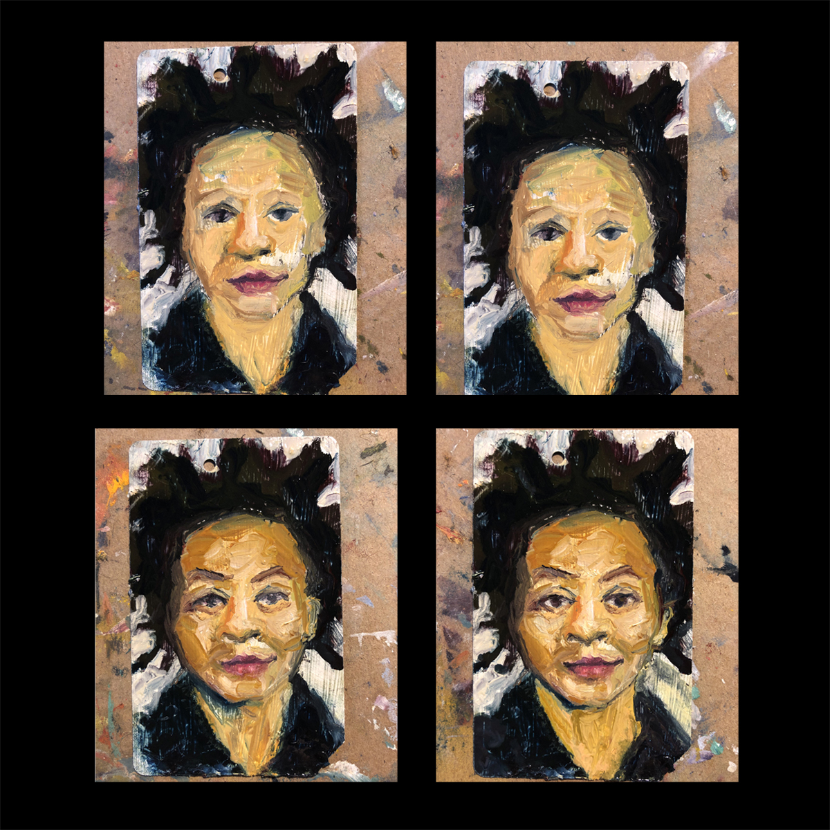
NYC Metro Card Kara Walker No. 1

One of my favorite artists:

NYC Metro Card Kara Walker No. 1
2" x 3.5" Oil on Metro Card
Available for purchase here.


Some close ups:


I went through many false starts and wipe offs before finally feeling good about this likeness - here some process shots of this bumpy ride:


Sunday, November 03, 2019

Friday, September 25, 2015

The Night Shift Resurrection

I started this subway painting months ago but was promptly sidetracked by a family health situation (mom is on the mend) and only returned to finish it recently.


I had documented its earliest stages:


I'd been pretty pleased with the figure at this point - but her head was troubling me. 


I decided to simplify the background and got a nice shape going on with her head and haircut - for some reason I wiped out her legs and feet, ugh:


I should have left her head alone - now I felt like I disturbed that nice haircut, and her feet were not cooperating. It was at this stage, I think, that all hell broke loose in my mom's life (fell and broke a hip, oy!) and the painting sat for several months, staring at me:


I finally picked up the brushes again last month and finished:


Or so I thought! I continued to noodle it a bit (trim her hips and tinker with her legs - argh! Will update this later - but I have to get this blog back to life so up she goes.

Tuesday, June 10, 2014

Putting the Custom back in Customer - Part 3 of 6

Next up in the commission series - this daunting landscape of a small city in Italy. Anyone recognize it? It reminds me of Florence but I don't see that iconic dome or any sign of the Arno River. 

My client decided that this photo would be another of the 3 to be recreated in black and white, no watercolor. First, I de-saturated the image so I wouldn't be distracted by the color and applied a grid to the picture. As before, this helps me digest the scene in smaller bites and keep the proportions in order.


I used photoshop to tweak the levels of dark to light, this helped me see more detail by exaggerating the lights and darks.

I again applied a light pencil grid to my paper and dove right in. 


Here's a close-up:


Last step, applying layers of ink, thinned with water, to create volume. Here's the final image, cropped to 9"x12." There wasn't a singular focal point in the original photo, it was rather flat, so it was a challenge. Still, I think the end result is lively and interesting. What do you think?


Next up, the Italian country side in living color……..

Friday, May 30, 2014

Putting the Custom Back in Customer - Part 2 of 6

Actually completing one of the 6 pieces commissioned gave me some confidence -- the dread began to dissipate. I decided to turn to one of the ink and watercolor pieces next, to switch up the action. 

I pulled my watercolors down from the shelf, literally dusting them off since I hadn't used them in quite a while. A quick rinse of the palette under the faucet restored the exposed clumps of paint to a fresh and tempting bounty of color:

Unrolled my packet of brushes as well.

Note my battered radiograph pen: -I have about a dozen of these in varying line widths but they are notoriously delicate and easily clogged. Thankfully I was able to get my .50 weight flowing - I used it for the line work in each of the paintings/drawings.

I decided to work on the Hawaii color photo next as I thought it would be the most straightforward. Here is the photo my client provided with my own grid added in photoshop:


Looks like a solid black silhouette, with just huge clumps of black along the lower quarter of the painting. I decided to adjust the levels again (in photoshop) so I could get a better idea of what was going on in all those shadows. It's surprising how much more detail is hidden in those dark areas:

 I knew I wanted to simulate the appearance of the original photo but the level-adjusted version gave me a bit more information to create an underlying structure. Even if it would ultimately disappear under layers of watercolor, it was helpful for me to see more of what is actually happening. 

Here's the first line drawing:


Ok, it's a start. Then more line and some layers of watercolor. I knew that hotspot of the sun would essentially be the one spot on the page that had no ink, no color.  I had to be careful to keep that small area completely clear, working from light to dark:


I decided to mix deep Prussian blue with the black ink to create the shadows, that gave them a little more complexity and depth, rather than just painting everything with a deep flat black.
And the final, cropped down to 9"x12," - done!


Stay tuned for more tomorrow…….

Thursday, May 29, 2014

Putting the Custom Back in Customer - Part 1 of 6

Commissioned works always un-nerve me. Always. 

Every time I accept a commission, half-way through I tell myself that I just won't accept another. The fear of letting down a customer, not meeting their expectations, always fills me with dread. I become a nervous wreck.

Then I push my way through it and all is well with the world. And I accept another commission, the cycle repeats…

I thought it would be interesting to share the process of my latest commission with you -- it was a big one and took a good deal of time (much longer than I'd anticipated) but I documented every step. 

Earlier this year a customer contacted me to see if I would consider  taking on a rather daunting project:  a series of paintings based upon a variety of travel photos she and her husband took while in Italy, Hawaii and Japan.  After a few emails back and forth and the forwarding of several potential photos from which to choose, we agreed upon 6 final images. Three were to be recreated as pen and ink drawings and 3 would be completed with ink and full color watercolor. All would be 9"x12" in their final size.


Here are the 6 photos we settled upon as sources:


After further discussion, we agreed that the 3 on the left would be the sources for the color paintings and the 3 on the right would be the sources for the pen and ink drawings. I de-saturated the 3 on the right in Photoshop, so I would see them only in terms of their value (levels of black-to-white) rather than be distracted by their color:


Let's walk through the steps I took for each - I approached this project differently than I would if I were doing a painting on my own from my own sketches or photo references. I tend to be much more irreverent with my source material and improvise more when creating my own paintings, for example, such as this one:


I'm sure you know that these leaves were not, in reality, purple and turquoise and coral and magenta, right? This is much more of an impressionistic or expressionistic version of the broad green leaves that were sitting before me.

BUT, I feel that when I take on a commission, from someone else's vision or photos, I feel like I need adhere more to what is before me, to be more loyal to the source if the aim is to please someone other than myself.

That being said, I was much more cautious with my preparation than I might have been if I were painting on my own, riffing as it were on the source material. I was MUCH more exacting in my process so that I would be more true to the photos submitted.

Let's go with each painting from start to finish. I'll focus on just one painting per post. First up was the Hawaii black and white. As I said, I stripped the color from the photo, scaled and cropped it to 9"x12" and drew a 1" square grid over the top. I prepped my drawing paper (Arches Cold Pressed Watercolor block) with a similar, lightly penciled grid, so I could create the image on the paper in the proper proportion:


There's a lot going on in this image - whew. I then decided to tweak the levels in Photoshop so I could see more detail in the dark areas. I wasn't quite sure what I was looking at in some places. The "Levels" adjustment let me see more:


I was off to a ripping-good start, as I drew fairly free hand on the paper and then began to add in some ink washes, to create volume and contrast:


And then, I'm sorry to say, I inadvertently my cat, Goose, in my studio for a full day. Of course, he chose to punish me by making himself comfortable on the drawing-in-progress and also, well, who knows exactly what happened here, but he ruined the piece. I'm sparing you the graphic evidence and just sharing this black and white photo of his vandalism: the large stain along the bottom.


Argh!!! It was ruined. I had to scrap it and go back to the drawing board. So a new piece of paper, with new pencil grid lines and re-create the scene. This time I remembered to take a photo BEFORE I began adding any shading. This is the new the pen-and-ink line drawing:


Still a lot going on in this drawing. Whew. But adding some ink washes, in varying levels (dark to light) I was able to bring some more clarity and contrast to the scene:


And here is the final scan, trimmed to 9"x 12" - note that this scan is more true to the actual warmer color of the ink than the photo above:


Ok, one down and 5 to go. And no more feline mishaps, I'm happy to report! I'll be back with the Hawaii color painting progression tomorrow…..