Sunday, September 22, 2013

Put A Bird On It Redux

Nothing could be more iconic than a New York City pigeon. Yeah, I know you've got pigeons in other cities,  but there is just something about sharing the sidewalks and streets of NYC with hordes of these "flying rats," that makes them feel uniquely New York. And truly intrepid Nw Yorkers they are.


 NYC Subway Card Pigeon No. 7
2.5" x 3" oil on metro card


Saturday, September 21, 2013

The Guggenheim Redux

Here's another NYC icon --


It's an icon I've tackled before. Let me know how this new version measures up against the prior versions:


 NYC Subway Card Guggenheim No. 1


 NYC Subway Card Guggenheim No. 2


Here's a close-up of the newest version:


And in a frame:

 NYC Subway Card Guggenheim No.  4

I can't pick a favorite. Just like my children............

But you can! Let me know.

Friday, September 20, 2013

Empire State of Mind Redux

I love painting this view - simple and iconic  - but experimenting with different color palettes. The same shape but different hues gives it a whole different mood and feeling. 

2.5" x 3" oil on metro card


 Compare it to one I did a while ago, such a different result:


2.5" x 3" oil on metro card


I think I'll do a series of these this weekend and see how many variations I can create. Committing to a series really frees you up to experiment - you've got the subject matter out of the way,  and also knowing that you're going to create as many variations as you like really takes the pressure off any single one painting. If it works, great! If it fails, put it aside and try something else.


Popped in a frame and it acquires a bit more grandeur, no?

NYC Subway Card Empire State Building No. 14
2.5" x 3" oil on metro card


Tuesday, September 17, 2013

A Better Face BOOK - Volume 1

Next up in my handmade tiny books -- a collection of some of my most popular pen and ink drawings, the Loosey Goosey portrait series.


There are 14 miniature prints in all, assembled accordion-style, just like my previous tiny book, NYC H20.  I printed the drawings on archival art paper, and fashioned the covers out of chipboard, covered with hand-made paper from Thailand.


I think between the two photos here. above and below, you can see just about every image that is included, save one - guess that will have to be a surprise.


This tiny book is secured with a slim leather strip fastened to each cover:


Signed and numbered inside the front cover, I've assembled a limited edition of 25. And yep, these are tiny, 2.5" x 3."


Available for purchase here.


Saturday, September 14, 2013

I'm going to submit -- how about you?


I've just received news of an "Upcycling Design Challenge," sponsored by online retailer Uncommon Goods. UncommonGoods celebrates high quality art and design by supporting a large community of independent artists and designers. 


For this  challenge UncommonGoods is soliciting talented artists to submit their most unique upcycled designs -- anything from handbags to kitchen tools, or from gadgets to wall art. 

I'm planning to submit several of my Metro Card paintings to the challenge, now also available in frames made of  sustainable wood (rubberwood and bamboo). Crossing fingers!

Here is the info provided to me by my contact at UncommonGoods:


-Grand Prize: $500 and an UncommonGoods Vendor Agreement

- We accept all sorts of materials as long as they are safe and animal-friendly. So no lead, leather, feathers, or pearls. We love unique materials, especially those that tell an interesting story, so don't forget to share your medium's tale with us in your product description.

- Judges: Writer and Reporter Yuka Yoneda, Chief Design Junkie at TerraCycle: Tiffany Threadgould. andUncommonGoods Associate Buyer for Home Decor Alexis Campagna.

-Submission Deadline: September 30, 2013 at 11:59 PM ET


-Submission page: click here.

- Judges will provide runners-up with a critique of their work, tips for marketing and growing your business.


Wish me luck, Night Shifters!


Thursday, September 12, 2013

A Painting Progression - the next lady on the train


 Step 1, first blocks of color:


Step 2 - more contrast, deep shadow under the bench, refining the shape of her head....


Step 3 - changed up the color in the background behind her, modified her hair, more detail to the bench and changed the color of her big, slouchy purse:


Step 4 - a touch of lipstick and more attention to her legs and feet. Hmmm, still muddling with them:


Finished? Not sure -- think I prefer her hair as in the step above and still not sure about the wall behind her head nor her folded arms. Added the iphone earbuds but they're not clearly attached to her head! Happy with her legs and shoes, tho, very happy:

Back to the drawing board -- stay tuned for the finale.

Sunday, September 01, 2013

"Give me such shows — give me the streets of Manhattan!" Walt Whitman


A stroll through Times Square is rarely on my schedule - to be truthful, I avoid it whenever possible. It's a must-see for visitors but hellish for locals.

Still, I was happy to take on a commissioned painting for one of my Etsy customers - it gave me the chance to see Times Square in a different light. Or rather, as a jumble of lights and colors. 

It was tricky condensing that landscape into a 2.5" x 3" rectangle, particularly since there really isn't one iconic image that screams "Time Square" -- it's really the cacophony of sights and sounds that you see as you do a 360 degree panorama-style view of the place. 

I decided to stick with a very loose, impressionist style to just suggest the buildings and lights at night. I added a slice of a taxi in the foreground that I think pulls it all together:


And once framed, giving you a chance to stand back and take it in, I think it works - what do you think?

Subway Card NYC Times Square No. 1
2.5" x 3" oil on Metro Card


Friday, August 30, 2013

Little Book of NYC H20 - Plus, How To Make a Tiny Book!


I couldn't pick out a favorite among my two dozen or so water tower sketches and thought it would be ideal to collect them all in a miniature book;  you don't have to pick a favorite either, collect a dozen in one fell swoop!

2.5" x  3" Handmade paper cover and archival art prints, with leather tie strip


 I've made a limited edition of these mini books - 25 in total. Each is signed and numbered inside the front cover.


Here's a quick at-a-glance reference to show you each of the prints that are included in the book:


 A lovely handmade treasure for yourself or you favorite New York-ophile:


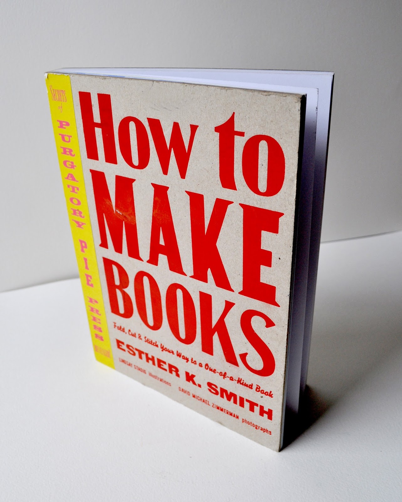
I'd never made a mini-book before, or any kind of book for that matter. But was inspired after coming across this terrific volume, with a very straightforward title:


The accordion-style book seemed to be the perfect "starter" for a new book maker like me, since there would be no need to actually "bind" the book with a needle and thread.  I turned to that section and saw several options and suggestions:


I decided I'd make my first attempt just using inexpensive materials since I was bound to screw it up the first time around. No sense wasting my lovely handmade paper from Thailand and my archival prints on my first effort. Let's just make a down-and-dirty cheapo version first, to make sure I get the process right.

So I decided to follow the plan at the bottom of the page, the H-I-J folds and cuts. I used photoshop to lay out miniatures of some of my pen and ink drawings and just printed them out on regular plain paper with my regular printer. I had the foresight to number the images since I wasn't quite sure where they would appear in the book after the folding, cutting and re-folding took place.


Then I cut according to the instructions in the H-I-J steps:


So far, so good, I'm thinking.......

That is, until I folded it according to the instructions - and some of my lovely ladies were upside down!

See? I knew I would screw something up the first time out of the gate. So I checked which numbered images ended upside down and re-arranged the images in the print file. Seems I had to turn the top row and the third row images upside down so they'd come out properly in the accordion fold. Duly noted! 

So let's try this again:


Ok, I didn't take a photo of the next step, the re-folding, but trust me, everybody is now right side up:


Next, cut two pieces of chip board to be used as the "cover." I cut them just slightly larger than the pages:


But before I  go to work on those covers, I had to make sure those folds will really hold. I placed the accordion under a very heavy book for several hours:


What better weight than "The History of Art?"


Meanwhile, back to the covers. I knew I wanted to use the lovely handmade paper from Thailand that I had purchased in large sheets. But again, my test book was going to use something more pedestrian, so I could get the process right. My daughters had some decorative papers in their stash:


It was a bit heavier than the papers I planned to use so I affixed it to the chipboard with some rubber cement. A bit messy and probably not the best adhesive for the lighter handmade papers. But for now, it would work.

Cut the paper and trim the corners so they'll fold more easily:


 I wasn't too worried about sloppy edges -- the first panel of the accordion would be adhered to the cover and would make a neat and clean inside page. So my prototype taught me a few things:


First, I realized that I wanted to make sure the first and last panels on my print page of images were blank; I didn't want an image immediately inside the cover but would leave that space blank for my signature and the edition number.

Second, I decided to use much more lightweight papers and would need to affix the paper with something other than rubber cement. 

Third, how would I keep the book closed? I'd seen other books that used a thin leather strap but realized I needed to insert two lengths of the strip in between the cover and the page of the accordion. Doh!

Ok, so now I went ahead with my high-end versions, happy to have made my mistakes on the prototype first.


I pre-cut strips of these beautiful papers -- hand-made in Thailand from mango and/or banana leaves:


But instead of using the rubber cement adhesive, I used this acrylic gel, inside and out. The gel served both to fuse the chipboard to the paper and also to seal the outside and make it more durable:


And this time, I made sure to insert two leather strips just inside the front and back panels, before affixing the accordion to the covers:


And voila!

I deliberated a while about giving it a title  -- NYC H20 seemed perfect. I printed the title out on translucent adhesive sheets and finally, I was done!


2.5" x  3" Handmade paper cover and archival art prints, with leather tie strip


I hope you found this tutorial useful -- two more editions of books are in the works, stay tuned!