Showing posts with label typography. Show all posts

Wednesday, April 25, 2012

City Painting Packs it in

Finished!


I

And finally on its way  --


With a bit more cardboard, plastic, bubble wrap and tape, of course .... it's huge.


Going all the way across the country -- UPS ground should get it there by early next week. 

Anybody else out there have an idea for a custom painting -- your favorite places, family names, or what-have you, email me for a quote!

,

Saturday, April 07, 2012

City Painting - final stages

I'm pleased with how this painting is coming along -- and am nearly finished.


I was skeptical about the color-combination requested -- but using the Payne's Gray as the base, a nice cool, bluish gray, has resulted in a really lush, rich painting. 


It's funny, but sometimes I can't see the problem areas clearly until I take a wide photo. The camera does cause some distortion, since the painting is so large and I'm taking the photo at a short distance. Also, the uneven lighting casts some glare on the surface.


Even allowing for some slight curving distortion, in the photo, I can still see some areas that I want to even out a bit. The big "C" in Tacoma is a little lopsided, the baseline text of "WEST" in the upper right is uneven, and the surface of the letters in "Las Vegas" need some work.


But otherwise, almost done!


Do you have an idea for your own places/names painting? Put your order in  here,
or email me for more information.

Wednesday, March 28, 2012

A Custom City Painting in Progress - Part 2


So where did we leave off?


I blocked in the entire background field, varying the hue and the value, leaving nice thick swaths of brush strokes. This is a painting after all, not a bstore-bought poster. Let the hand-made quality shine through.

Now, on to the type.

And with typography, there's a fine line between aesthetically beautiful, hand -made  renderings ... and just plain sloppy. That is why I did take great care to transfer the type to the canvas: size, proportion and alignment are true and measured. Edges are strong if not precise. At a distance, the edges of this particular typeface appear strong, clean and clear. Close inspection may reveal soft variations and irregularities -- I don't paint with a ruler - but the general strength of the line is strong and solid.

I love lines.

My client wanted the type to be white, with a slight shadow or dark edge. Flat white fill would have been an easy solution. But instead, I began painting the type with a dark layer of Payne's Grey and then gradually built it up with lighter values of paint. 

See the edges of "Las Vegas"   and then the light gray filling inside the letters (below). Compare to the word beneath, where brighter layers of white have been added on top of the same treatment.

See what I mean? The type is no longer just flat. It's nice and chunky.


Up close and personal, it's not perfect. But it works.


"C" for super "CHUNK."


I'm very close to finishing and I'm pleased with the result so far. Check back over the weekend to see the final painting.

Please contact me if you have a painting of your own in mind -- cities, countries, places or names of your choosing. Your family members, perhaps?  Anything is possible; I can create a unique piece for you or a loved one.


Tuesday, March 27, 2012

A Custom City Painting in Progress - Part 1


Shades of gray...........


I'm so pleased to be taking on another commissioned "cities" painting -- and I've been documenting the steps so you can see that it truly is a painting that is custom made-to-order.


My client has requested a personal array of cities to be displayed on canvas, as offered here, and also chosen a color palette: white lettering on charcoal gray. 


Here we go............


First, I created a layout of the type on my mac. The result is not very painterly, far from it -- but it does provide a plan for the painting.


I then scale up the image to 36"x48" and printed out black and white versions of the image in pieces, on regular 8.5" x 11" paper. I will use these printouts to transfer the design to the canvas surface.


To transfer the type, it's time to go old school - I cut the pieces to transfer, trimming them down to the edges, and then flip them over. I take a nice soft piece of charcoal and cover the back side of the paper with it, until it's thoroughly covered.


After marking the canvas with a t-square, creating the alignment lines for the type, I lay down the printed sheets of text, charcoal side down, and tape in place. Using a ball point pen (but any sort of stylus will do)  I trace over the edges of the type on the printed side of the paper strips. This effectively transfers the charcoal onto the canvas surface.


This is a very old technique -  using a "cartoon"  -  a variation of which would be to prick very tiny holes through the original printed paper (or drawing), to be transferred. After placing the pin-pricked paper on your canvas, you "pounce" it with charcoal dust which passes through the holes onto the canvas, effectively transferring the outlines of your design.


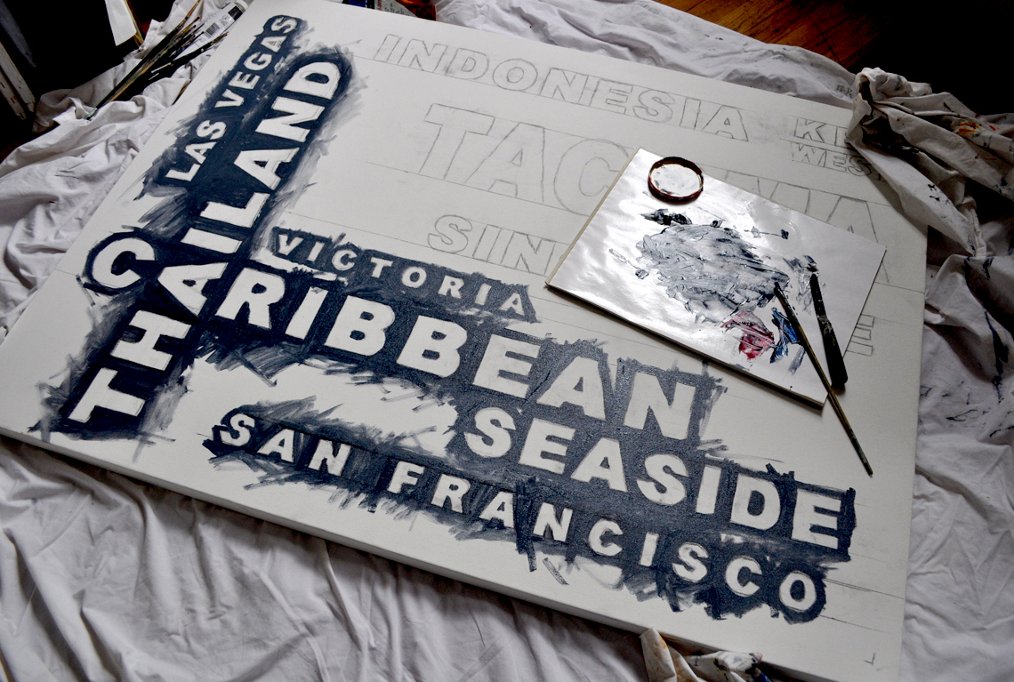
Since the charcoal is easily smudged, I  next used a soft pencil to roughly re-draw the lines and make them stronger. City by city, the canvas fills up with sketches.


Now it's time to mix some paint. 


I could use a simple mix of black and white, but that would be rather dull and flat.  Rather than using any black, I am using Payne's Gray (below, left), which is a dark, cool, bluish gray, made from mixtures of black, blue and occasionally crimson pigments. I also pulled out tubes of Prussian Blue, (second from left), Alizarin Crimson (3rd from left) and Titanium White (far right).


The Payne's Gray comes out of the tube looking as if it were black. As I mix in some Titanium White, it begins to take on a cool, rich and smokey gray color.


By adding small, sparing amounts of the Prussian Blue, the Alizarin Crimson and the Titanium White,  I can change the appearance of the gray ever so slightly. I don't mix large amounts of paint at one time, so each time I mix up a quantity of paint, it is never the same. And that's great!  I'm not painting a living room wall nor the side of a house -- variation in color and value is a good thing. 


I begin to lay in the background color around the edges of the lettering.


I mix and re-mix, varying the amounts of pigment and white and gradually fill in the background around the letters, letting the variations in value and hue remain.


Next up -- layers of paint on the letters.... stay tuned for part 2.......