Shades of gray...........
I'm so pleased to be taking on another commissioned "cities" painting -- and I've been documenting the steps so you can see that it truly is a painting that is custom made-to-order.
My client has requested a personal array of cities to be displayed on canvas, as offered here, and also chosen a color palette: white lettering on charcoal gray.
Here we go............
First, I created a layout of the type on my mac. The result is not very painterly, far from it -- but it does provide a plan for the painting.
I then scale up the image to 36"x48" and printed out black and white versions of the image in pieces, on regular 8.5" x 11" paper. I will use these printouts to transfer the design to the canvas surface.
To transfer the type, it's time to go old school - I cut the pieces to transfer, trimming them down to the edges, and then flip them over. I take a nice soft piece of charcoal and cover the back side of the paper with it, until it's thoroughly covered.
After marking the canvas with a t-square, creating the alignment lines for the type, I lay down the printed sheets of text, charcoal side down, and tape in place. Using a ball point pen (but any sort of stylus will do) I trace over the edges of the type on the printed side of the paper strips. This effectively transfers the charcoal onto the canvas surface.
This is a very old technique - using a "cartoon" - a variation of which would be to prick very tiny holes through the original printed paper (or drawing), to be transferred. After placing the pin-pricked paper on your canvas, you "pounce" it with charcoal dust which passes through the holes onto the canvas, effectively transferring the outlines of your design.
Since the charcoal is easily smudged, I next used a soft pencil to roughly re-draw the lines and make them stronger. City by city, the canvas fills up with sketches.
Now it's time to mix some paint.
I could use a simple mix of black and white, but that would be rather dull and flat. Rather than using any black, I am using Payne's Gray (below, left), which is a dark, cool, bluish gray, made from mixtures of black, blue and occasionally crimson pigments. I also pulled out tubes of Prussian Blue, (second from left), Alizarin Crimson (3rd from left) and Titanium White (far right).
The Payne's Gray comes out of the tube looking as if it were black. As I mix in some Titanium White, it begins to take on a cool, rich and smokey gray color.
By adding small, sparing amounts of the Prussian Blue, the Alizarin Crimson and the Titanium White, I can change the appearance of the gray ever so slightly. I don't mix large amounts of paint at one time, so each time I mix up a quantity of paint, it is never the same. And that's great! I'm not painting a living room wall nor the side of a house -- variation in color and value is a good thing.
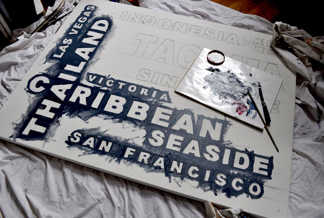
I begin to lay in the background color around the edges of the lettering.
I mix and re-mix, varying the amounts of pigment and white and gradually fill in the background around the letters, letting the variations in value and hue remain.
Next up -- layers of paint on the letters.... stay tuned for part 2.......


No comments:
Post a Comment