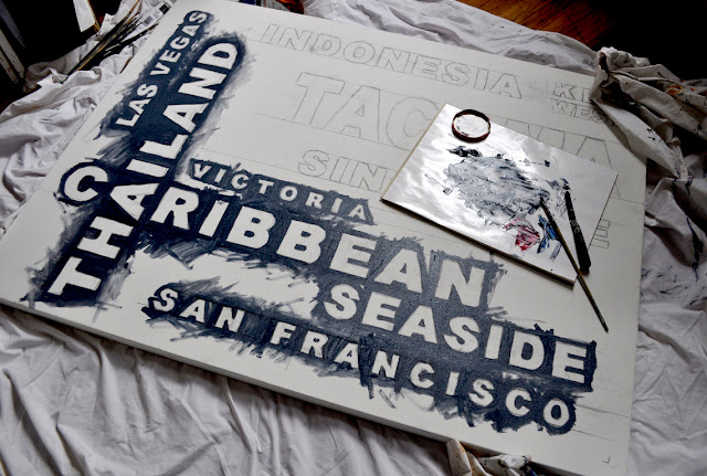
So where did we leave off?
I blocked in the entire background field, varying the hue and the value, leaving nice thick swaths of brush strokes. This is a painting after all, not a bstore-bought poster. Let the hand-made quality shine through.
Now, on to the type.
And with typography, there's a fine line between aesthetically beautiful, hand -made renderings ... and just plain sloppy. That is why I did take great care to transfer the type to the canvas: size, proportion and alignment are true and measured. Edges are strong if not precise. At a distance, the edges of this particular typeface appear strong, clean and clear. Close inspection may reveal soft variations and irregularities -- I don't paint with a ruler - but the general strength of the line is strong and solid.
I love lines.
My client wanted the type to be white, with a slight shadow or dark edge. Flat white fill would have been an easy solution. But instead, I began painting the type with a dark layer of Payne's Grey and then gradually built it up with lighter values of paint.
See the edges of "Las Vegas" and then the light gray filling inside the letters (below). Compare to the word beneath, where brighter layers of white have been added on top of the same treatment.
See what I mean? The type is no longer just flat. It's nice and chunky.
Up close and personal, it's not perfect. But it works.
"C" for super "CHUNK."
I'm very close to finishing and I'm pleased with the result so far. Check back over the weekend to see the final painting.
Please contact me if you have a painting of your own in mind -- cities, countries, places or names of your choosing. Your family members, perhaps? Anything is possible; I can create a unique piece for you or a loved one.


