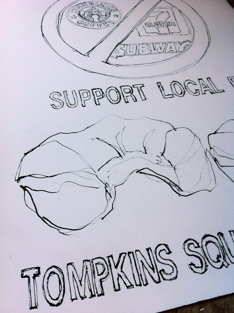
Our beleaguered East Village has seen the gradual creep of corporate homogeneity of late. Eccentric cafes are being squeezed out by Starbucks-by-the-dozen, hardscrabble bodegas yield to the bland conformity of 7/11s, and your favorite taqueria may morph into a Subway shop overnight.
The owner of Tompkins Square Bagels, Chris Pugliese, enlisted my help to ask his customers to support local small businesses in our neighborhood across the board. His suggestion -- a large hand-painted sign imploring our neighbors to "just say no" to the invasion of the chains in the East Village.
Chris laid out the details of exactly what he wanted to see in the sign: the words "just say no" and the logos of the 3 aforementioned chain shops drawn behind the universal "prohibited" icon, the red circle with a slash. I offered to execute the idea in a hand-drawn pen and ink style, with watercolor on a large sheet of paper, approx. 2' x 3'.
I laid out the first plan with some newsprint and typeset words, printed of my computer. I sketched in a bagel and a muffin across the top and added some coffee cups along the bottom.
Chris like the plan and made some suggestions. In order to really shout out the message, we moved "just say no" to the very top modified the proposed visuals -- just two big bagel halves along the bottom. I was good to go!
I transferred the layout to a large sheet of Arches 140 lb. cold press watercolor paper, using a pencil and graphite transfer paper. Next, the pen and ink to draw the border lines for all of the text and images.
I used a sketchy touch......
Then I broke out the watercolors......
And then I began painting in the logos....
You recognize them, right? Sketchy or not....
Then I began to form those big chunky bagels.
Got it all essentially filled in, and a light wash to establish the bagels. The background was next.......
I started with a light wash of blueish-lavender..... I wanted it to be a rich eye-catching color but couldn't let the type disappear, so I started with a very light touch and also fully rendered the bagles.
And then gradually built it up a bit deeper with more washes of blues and purples.....
More color.
And voila!
And please support you own local small businesses............


